In the meantime, I’ve found myself in the possession of both the UK and US copies of ‘The Magicians’ so I thought it was time to do another ‘What cover would you go for?’ post. These posts aren’t a general ‘UK vs. US cover’ thing; they only happen when I actually get two copies of the same book (I’m not going to read both books and it’s only fair to mention the one that won’t be read seeing as someone went to the trouble of posting it...)
So here goes...
Here’s the UK cover,

And here’s the US cover,

What do you reckon? Once again, I’m going for the US cover as my favourite and I’m starting to wonder if US covers are as bad as they’re cracked up to be...
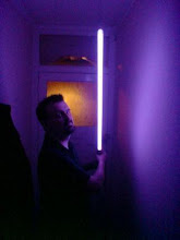
In this case, the UK cover looks to me like a ‘Da Vinci Code’ style knock off; all shadowy and with a figure that you just know will crack the code if he can just stay one step ahead of the sinister organisation bent on his destruction. It wasn’t until I looked at the blurb that I realised ‘The Magicians’ wasn’t this kind of book at all and that it was actually a book that I wouldn’t mind reading.
The US cover though... Here’s a cover with an element of fantasy that ties in neatly with the blurb and intrigued me right from the start. I also liked the fact that the artwork felt a lot more ‘open’ as well. I wouldn’t have picked the UK edition off the shelves but I would have done with the US edition.
How about you though? All comments welcomed! :o)

13 comments:
The US cover is definitely better, but I am biased when it comes to nature based covers or anything with a green hue.
I agree that this time the UK cover is a Dan Brown knockoff, but in all fairness it's still a cover that fits the title.
I like them both but agree the U.S. cover's better for this book and the U.K. one has a Dan Brown vibe (which is a bad vibe, for me ;-).
I have to go with the US cover. It's a lot more simple and leaves the rest up to your imagination. The UK cover just seems too busy.
I like the UK better.
Not often I say this, but US cover for me. I've actually got the US version of this book, and the cover is really nice when you inspect it up close. Agree that the UK one is rather historical-thriller-ish.
I was looking at the US cover for Kim Stanley Robinson's new cover Galileo's Dream the other day and I think that one shows they're still quite capable of producing inferior covers on that side of the Atlantic.
This time I prefer the UK cover
sandro50
i must like the US cover as I stop nearly every time I see it to read about it.
I like both the covers but i'd go with the UK one on this cause it gives more of a mystical/magical feel than the US one. Also the UK cover goes with the book title dark corridors leading to more sinister environments you could imagine, whereas a tree does not really give the impression of magicians, for me at least.
I prefer cover which fit to the content of a book. In this case the UK cover is definitely the better choice.
I definitely prefer the U cover for this one and having read the book it is far more relevant, with the imagery it contains.
That will be US....
sorry
The UK version rocks!
Post a Comment