I haven’t done one of these for a while... Every now and then I get copies of the same book from two different publishers and such was the case with Max Brooks’ ‘World War Z’. I can only read and review one copy and that’s what I did here, way back in September 2008 as it happens...
And then another copy of the same book came through the door the other day... What to do with it? If you’ve been hanging around for a while you’ll know that my attempts to be fair to everyone resulted in the ‘What cover would you go for?’ posts; I get the two book covers to face off and see which one you all choose as your favourite. So without further ado...
The UK Cover

The US Cover
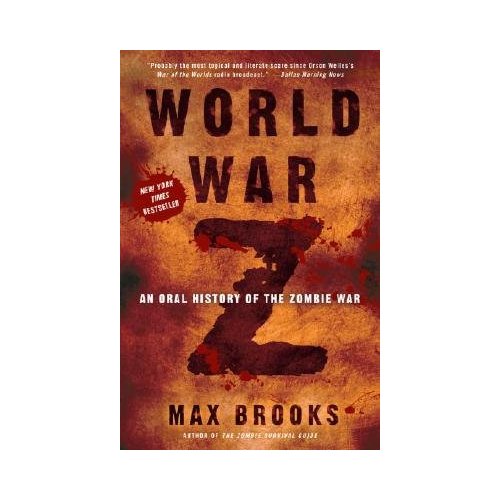
Wherever there are zombies there’s bound to be blood and the UK cover uses this to good affect with a cover that’s direct and to the point (the white background really draws your attention to the red...) I’m plumping for the US cover this time round though. Not only does it have the obligatory blood but the ‘bruise like’ colouring really captures the visceral nature of what’s inside in a way that UK cover doesn’t quite manage...
That’s me though, what do you all think? Which cover would you rather have on the bookshelf? All comments are welcome :o)


9 comments:
Just started reading your blog and LOVE IT. As to your question: I definitely prefer the first cover. Fantasy and sci-fi books have long been subjected to some of the ugliest covers imaginable, and as someone who would almost always prefer a "minimalist" look, I'm often disappointed (and disgusted) by busy, over-textured covers.
Definitely the US cover (I have it). The UK cover looks too 'clean'.
I prefer the second.. I really prefer darker covers when it comes to themes like Zombies or post-apocalyptic, dystopian etc.
I think the brownish color works better...like skin, flesh...
So, yeah, the US cover it is! XD
I like the first one the best. I like the stylised look and the colours :)
I really like the texture and colours of the US version, but the UK version has a much better layout. I'd say keep the UK cover.
The second cover is certainly more atmospheric. That said, I think the British cover is more eye-catching, and the jaunty angle of the text complements the UK edition of Brooks's Zombie Survival Guide. Whilst the UK cover is garish, it's also effective and eye catching for non Horror veterans. It's a tough call, I think I prefer the US version but that the UK one is the more effective marketing tool (which at the end of the day is the main purpose of the cover "from which we are not meant to judge a book" :P ).
I like the U.S cover
Both covers are pretty good, but I gotta say that I like the atmosphere of the US one a bit more.
The US cover makes me think of an apocalyptic event (such as zombies overrunning the entire world) while the UK cover reminds me of Oceans 11. Its a great book though, whatever the cover.
Post a Comment