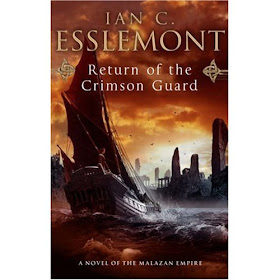
Here's the UK cover,

And here's the US cover,

Now I was pretty evenly drawn between the two covers but there was something about the UK cover that was bugging me. I couldn't quite put my finger on it but then it struck me.
Have a look at the UK cover again...
Now have a look at the UK cover for Esslemont's 'Return of the Crimson Guard' (same publisher)...

And then take a look at the UK cover for Esslemont's 'Night of Knives' (same publisher again)...

Someone at Transworld has got a thing about boats. Not just any old boat either, pretty much the same boat. The UK cover for 'The Other Lands' isn't quite the same (it's on the boat rather than looking at the boat) but it was close enough. The US cover stands out for me and is something I would associate with that book. The UK cover reminds me of other books before I've even got started on it. I don't know if Transworld are trying to attract fans of Esslemont and Erikson but I'm sure they could go for an approach that's better than rehashing covers from other books. The US cover has my vote this time. It is based on the German cover for 'Acacia' but somehow feels more unique than the UK cover.
What do you guys think though? Comments please! :o)
This is one of the first times that it's actually close for me. Usually, it's by far the UK cover over the US one unless the US cover is just copying.
ReplyDeleteI pick the UK cover for this as well, though. I guess I just like boats because I also love the Esslemont covers.
Seak
Uk cover. As soon as I saw it, it screamed Malazan to me. The US cover looks like a throwback to some 80's Us covers.
ReplyDeleteDefinitely the UK cover - much nicer.
ReplyDeleteI agree with Seak, pretty close for once, but leaning a little more towards the US!
ReplyDeleteDefinitely the US cover for me, finding the UK cover fairly repetitive and I'm not a big fan of boats.
ReplyDeleteSorry, why are we comparing a modern UK cover to a US cover from the 1970's?
ReplyDeleteNo really, I'm not joking ... I understand that these are tailored to what the market expects, but why are the fantasy covers in the US so outmoded and or childish. The artwork frequently looks like something a 13 fantasy doodler would do at the back of a math class!
The US Wheel of Time Series Covers are hilarious, very camp and silly (although the UK ones ain't much better) and as for the Harry Potter covers ...
The Mazalan books are a case in point, the cover of the Bonehunters in the UK is a dark and moody affair, the US version looks more at home on the riftworld.
I'm trying to work out where so much blood, death and sh*t fits in with the comic-book covers...
weird?!?
Yeah this is quite a close one, I guess the UK cover is more dynamic you can feel the spray on your face. But for some reason I prefer the US cover, I am an old man though.
ReplyDeleteI like the UK cover for "the other lands" better than the US one. Although the US one is good too. But I think the US cover would have been more suitable for the first book of Acacia.
ReplyDeleteAs for the other 2 covers of books by Ian C Esslemont they both look equally goo to me!
I usually like the UK covers better, especially in the Malazan Book of the Fallen series. However, I like the US cover of The Other Lands better. The UK cover is not bad at all but I think I'd lean towards the US cover on this one.
ReplyDeleteLike some of the others, I find both appealing, but the UK cover gets the edge.
ReplyDeleteAt least they're different pictures of pretty much the same boat. Check out this weird complete rehash:
ReplyDeleteGerman edition of Robin Hobb's Fool's Errand.
Tad Williams' The Dragonbone Chair.
This comment has been removed by the author.
ReplyDeleteI think it might be Steve Stone that has a prediliction for boats. I just noticed a week ago that the cover of Red Seas Under Red Skies is pretty darn similar.
ReplyDeleteWell, Red Seas Under Red Skies is actually all about boats and sailing.
ReplyDeleteNot to mention the cover represents perfectly one of the major scenes in the book.
Interesting conversation. I find it hard to pick a favorite. I like them both. Though, honestly, from the writer's standpoint, "liking" a cover can just mean being relieved that it doesn't suck.
ReplyDeleteThese don't suck; so I am pleased. Simple equation for me. ;)
UK cover. I love boats. Same boats, different boats, whatever boats... and sea :)
ReplyDeleteThe US cover of The Other Lands has been used for the German edition of Acacia. A good way to confuse people.
ReplyDeleteThat means different cover for US and UK edition and a mix up for other editions.
But who cares as long as the people buy the books.